Giving flowers is so last century … OK, it’s really…
The Psychology of Wall Art

One of the secrets to successful interior design in any space is that it’s not simply a loose collection of rules concerning colors, flow, and wall art – there’s a lot of psychology involved. Just like advertising, interior design seeks to adjust your mood and affect your thoughts using your surroundings, plugging into ancient and instinctive reactions to our environment. Knowing how things like the color you choose for the walls, the abstract art you hang in a room, or the furniture you choose will make you feel is the most difficult and important step towards truly grasping interior design’s secrets.
Interior Design Psychology 101
The basics of the psychology of interior design are pretty easy to grasp:
– Color: Humans feel most comfortable when the colors of a room contrast from floor to wall to ceiling – monochromatic rooms make us anxious. We feel best when our rooms mimic the real world: Darker floors for ground, lighter walls for surroundings, and lightest for the ceiling, representing the sky.
– Flow: No one wants to feel trapped, so furniture and other objects in a room must show a clear path from entrance to exit.
– Focal Point: People like a point to focus on and ground them in the room, something they can reference as they move about a space.
Design Psychology and Wall Art
The human mind sees a lot more detail than we’re consciously aware of, often perceived on an instinctive or more primitive level. The art we hang on the walls of a room can have a profound effect on our mood and reaction to the space:
– Contrast or Harmony: If the colors or subject of the art clashes with the rest of the room, it can make people feel disturbed or uneasy. It’s like a speck of dirt on your plate before dinner is served: It simply bothers people.
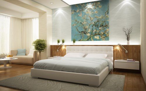
– Telling a Story: The images you choose as your wall art can calm people or excite them, so choose images according to the room they will appear in. Calming images, abstract art, and landscapes in the bedroom can help people let their thoughts go and rest. Images of food and other comforting things are ideal for a kitchen.
– Space: More is not always merrier. Walls crowded with prints can be intimidating and unhappy for people. It’s too much visual data to take in. Spacing out pictures and leaving lots of “white space” between the pieces can let people take in what’s happening and more easily and get comfortable with the space.
– Color: Aside from the general rules noted above, the color palette of your art will also have an effect on everyone who enters the room. Bright colors are often perceived as happy and inviting, while pale colors can be calming and restful. Dark colors are generally oppressive in large doses but are exciting when used sparingly.

Sometimes you can have truly wonderful images chosen for your wall art decor and yet once they’re on the walls something feels wrong. You can’t always articulate it properly, but it’s there – that’s the psychology of interior design making its presence felt. Now that you know what to look for, you can start figuring out why some images work or don’t work in rooms that your intellect says they should work!
When you’ve got that figured out, click here and we’ll take your chosen photos and turn them into canvas prints that will give your rooms the mood you want.


